Overview
NeighbourHire is trying to tackle a major issue we all face but could easily avoid: buying things we're only going to use once or twice. Not only does their app allow users to rent from their neighbours but it additionally allows them to make some cash on those items accumulating dust in the garage.
The Problem
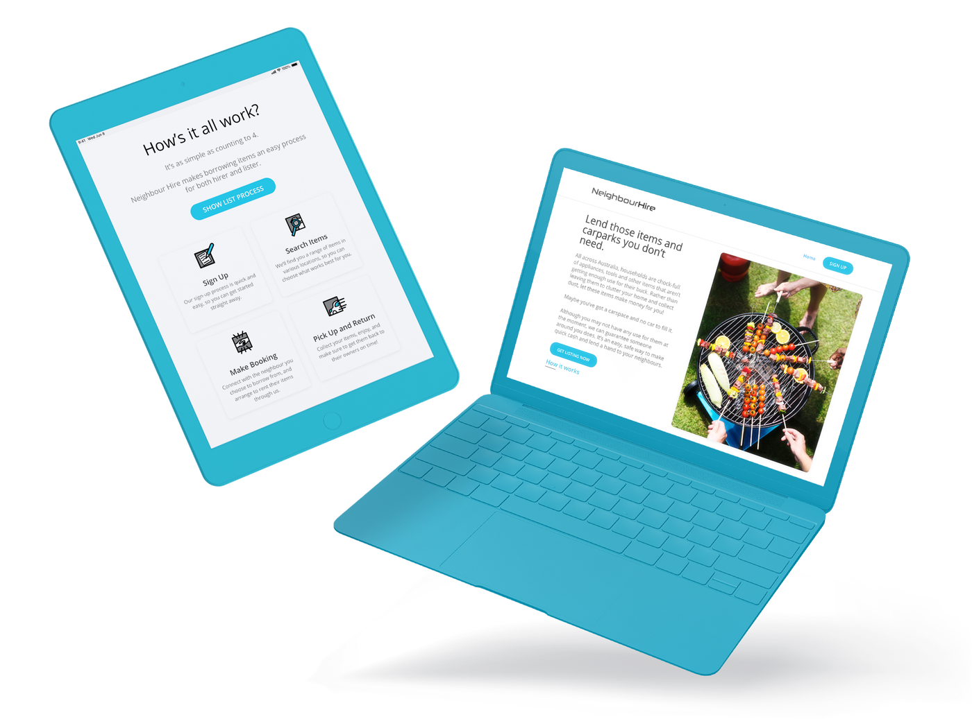
Although NeighbourHire has a mobile application in development they currently have no way for users to learn about or join their platform. I was brought into this project to build a landing page and signup application to allow users to start joining while the application is finalised.
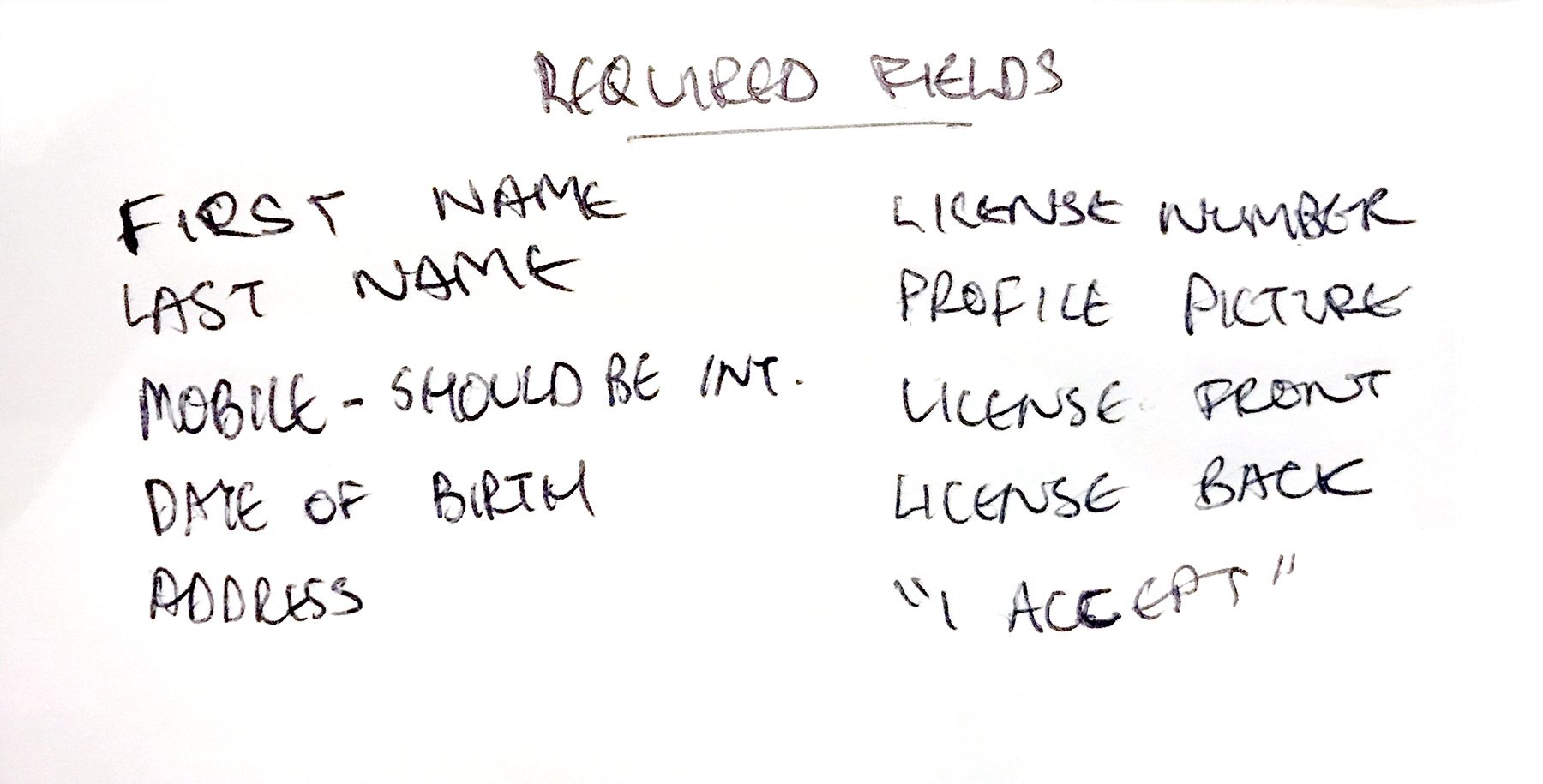
The goal was to drive users to the mobile application through a simple signup process. Requirements for signup were the users' basic details, residential address, identification, and a profile picture. As the application required a fair amount of detail it was important to consider the best way to break this information up. We needed to ensure the user wasn't overwhelmed and had a way to return to the application if they couldn't finish it in one sitting.
Additionally, the site needed to suit users who were both looking to hire and looking to post items. Rather than forcing the user to navigate to a completely seperate page, I wanted a way for them to easily switch between the two without being confused along the way.
The Process
Due to the limited time frame with the project, it was important to move as quickly as possible through all stages of the process, especially the research phase. Understandably, the client wanted to get the site up and running as quickly as possible, as they'd already invested a lot of time and resources into the app development. Therefore, the research phase was somewhat limited compared to my usual design process.
Simple UI for all the neighbours
Although it can be fun to play around with new technologies and creative designs, for this project, the end user is literally everyone within the neighbourhood. Therefore, the landing page and forms needed to be simple enough that any age or demographic could quickly understand the concept.
During the initial prototyping, I wanted to explore clean bold headings with the large legible body text.
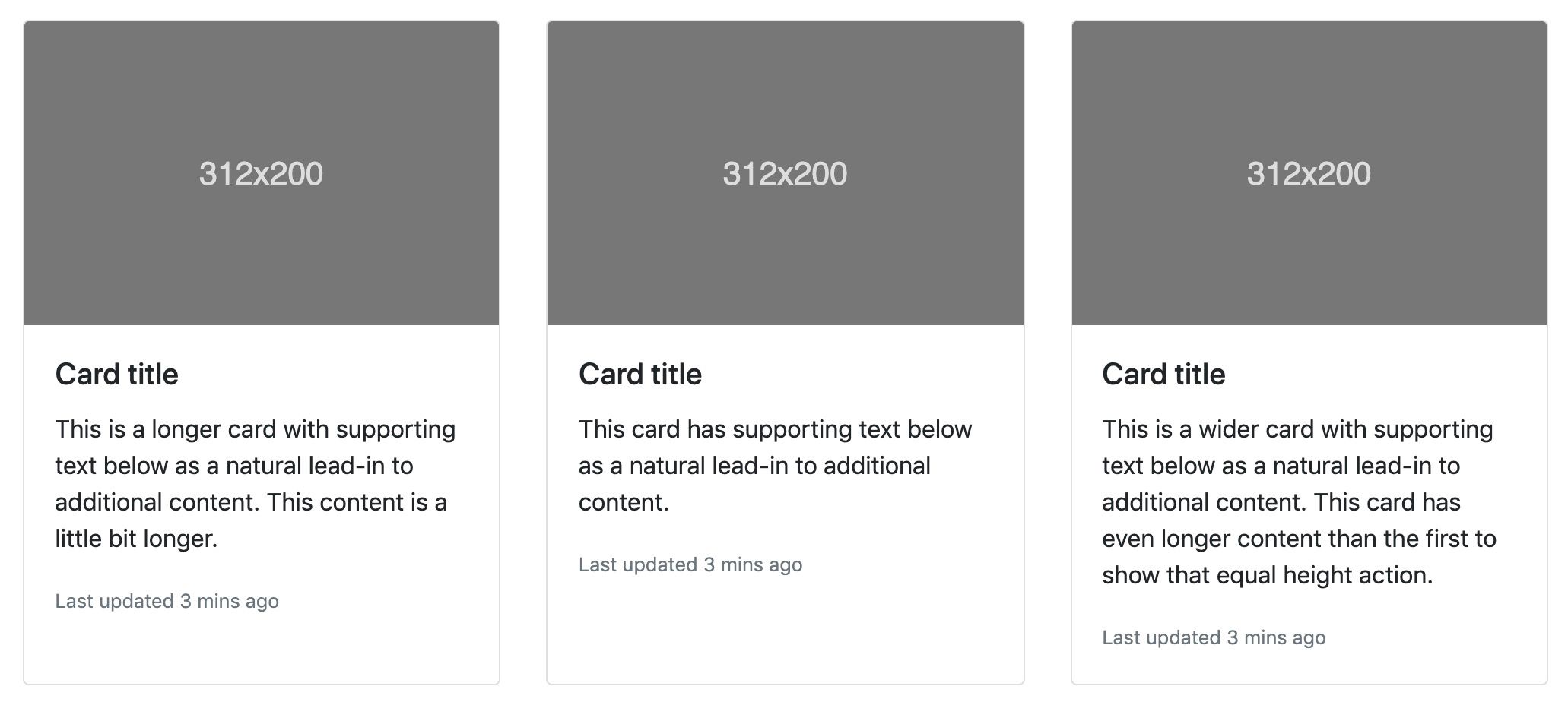
The idea behind 'cards'
When I was younger and someone in the neighbourhood did something kind, I would write them a thank you card. I never thought twice about it until this project came to be. In fact, research has shown the benefits of thank-you cards.
For this project, I wanted to explore that same idea in a digital sense. Bootstrap uses a component they call 'cards' and I took inspiration from this when designing the user flow and landing page.
Simplifying field options
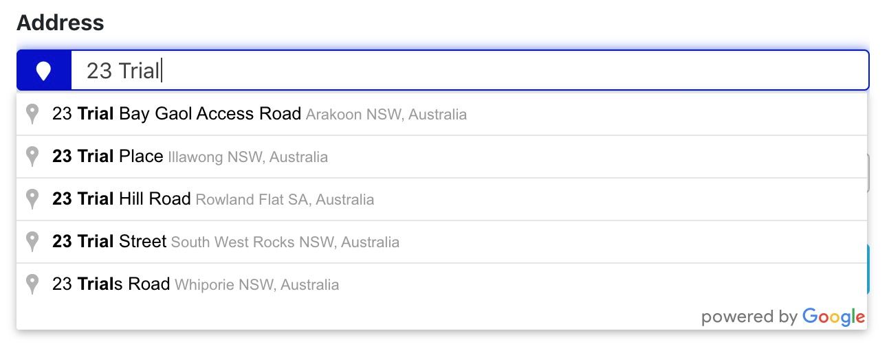
In addition to splitting the form into multiple parts it was important to speed up the flow for users as much as possible. To accomplish this I implemented a Google maps autocomplete option, specific to Australia.
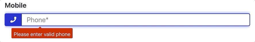
A requirement of the mobile application was that phone numbers are saved as an international format. To accomplish this without throwing errors at the user the site would detect whether the user had entered the number in the correct format, and if not, automatically change it.
2. Plan
During initial discussions with the team we began planning out the layout of the simple site. By the end of the meeting we had all of sites elements planned out. The aim throughout this project was to move fast and adjust later.
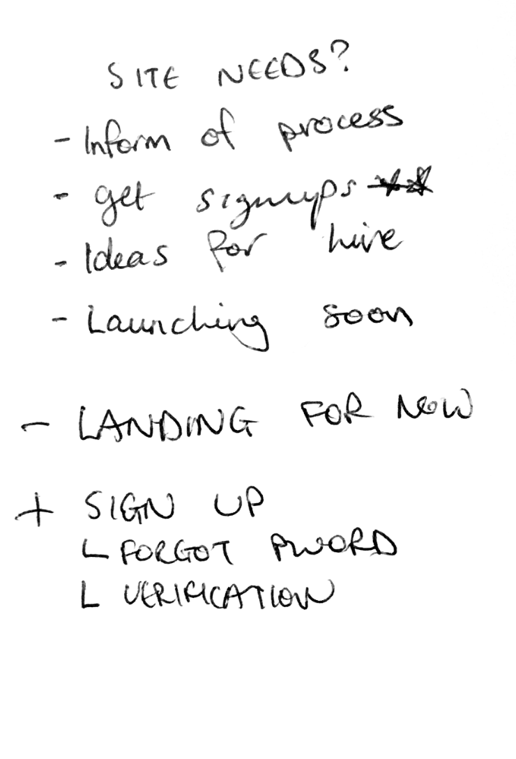
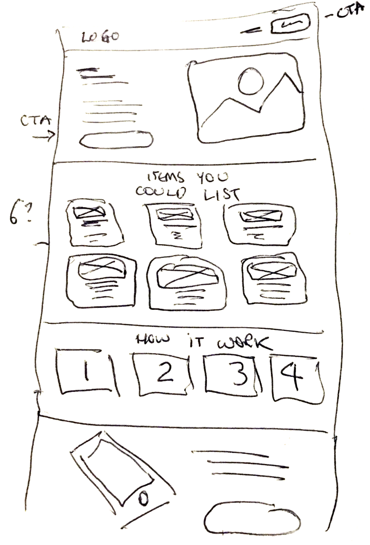
Simple plan and sketch from the first meeting
The Build
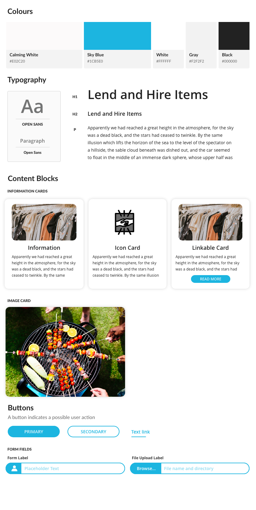
Design Guide
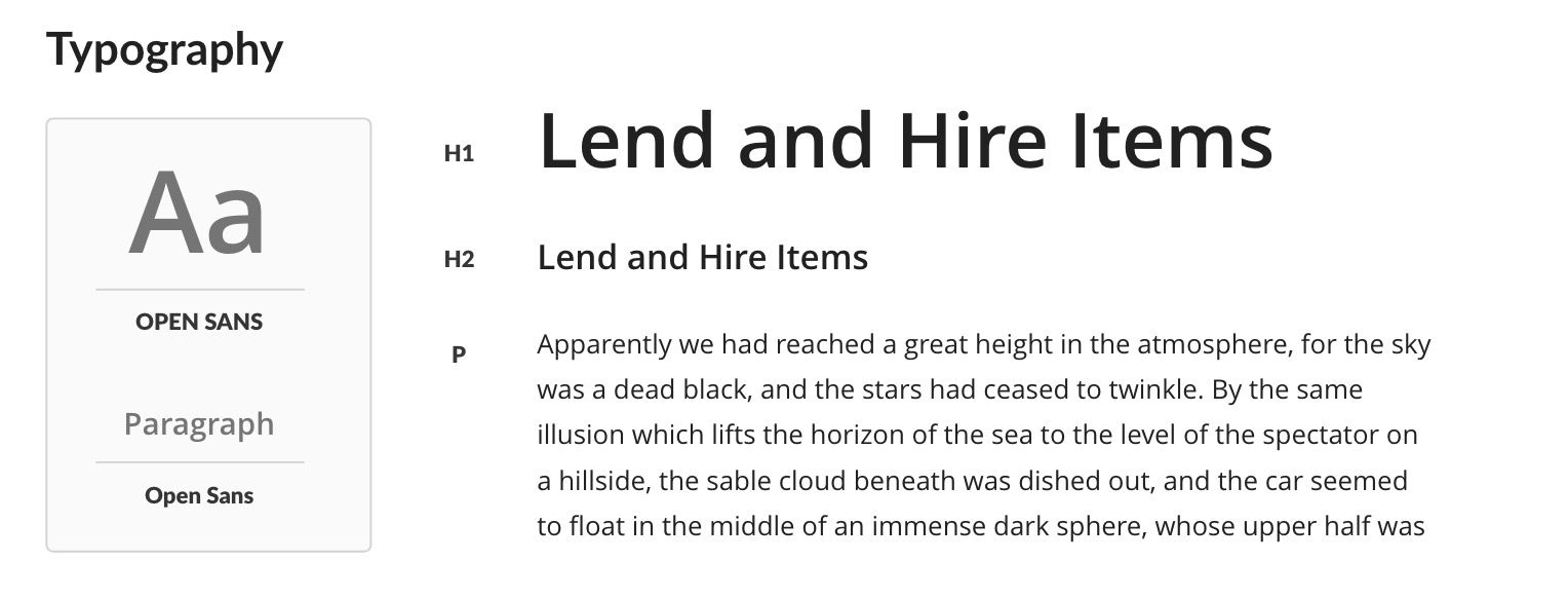
Bringing it all together, I developed the initial design guide to help guide the pages and forms of the website.
Prototype
NeighbourHire was looking to get this website launched and running as quick as possible. The prototype was created over 2 days and signed off quite quickly. This project was one of the fastest initial turnaround times I'd worked on. However, even with this in mind, I believe the final ideas allowed the start-up to showcase their platform and begin the signup process for users.
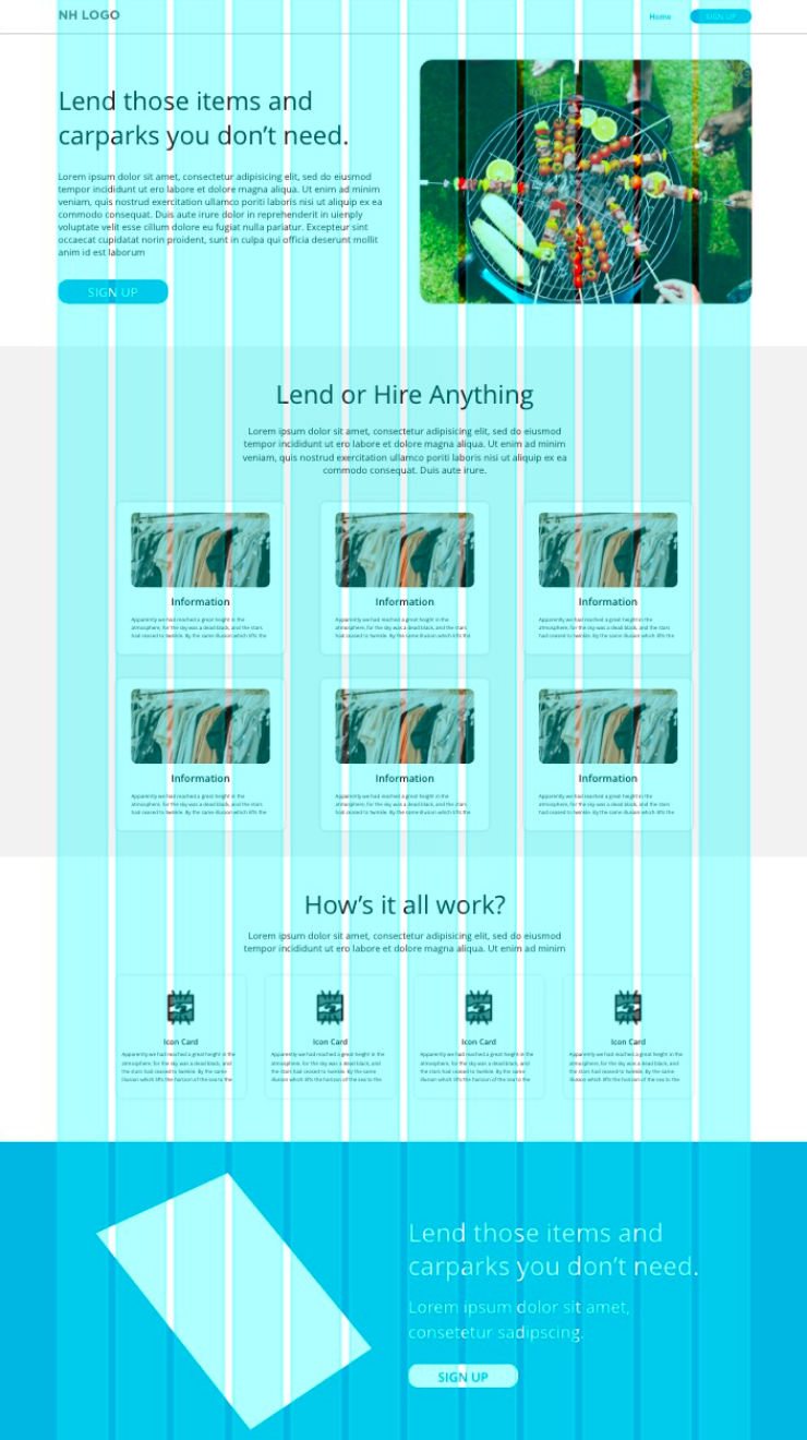
Prototype based on initial sketch
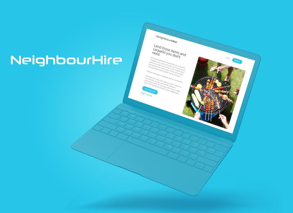
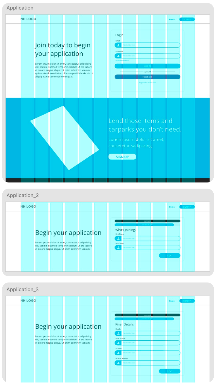
Final Website
As the plan was to get this site live and running NeighbourHire had asked I used a web platform that would allow them to edit in a drag and drop manner. For this, I opted for Divi - WordPress builder for the front landing page, while the signup & login, application forms, and other pages required by the mobile app were custom coded in line with the style guide.